Cultural Caravan
An identity as joyful and far-reaching as the music itself.
Cultural Caravan wanted to create an evolved identity rooted in their existing brand, yet better reflecting the world-class nature of their offerings, as well as the innovative and unconventional nature of their programming.
POSITIONING
BRAND IDENTITY
LOGO DESIGN
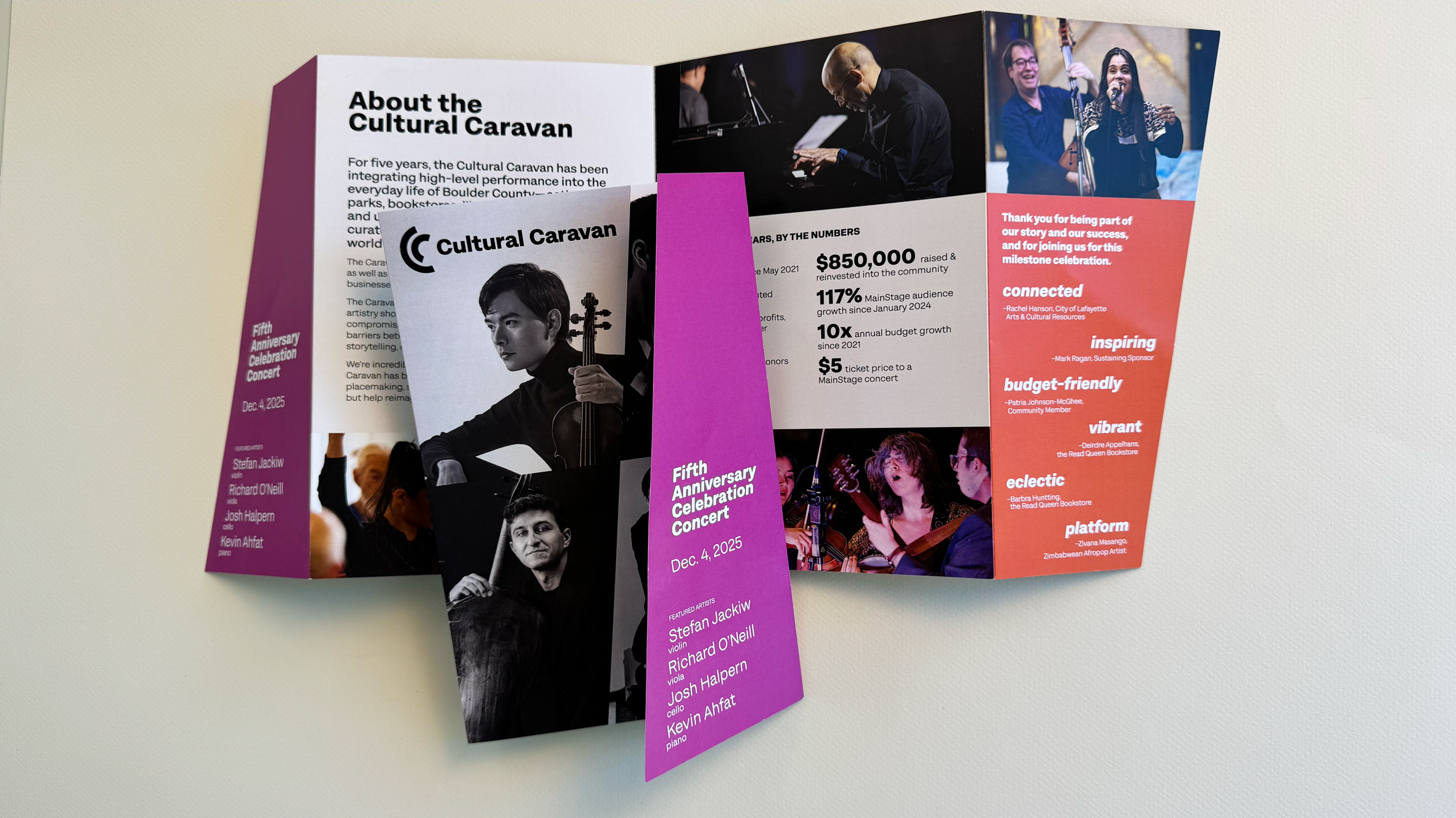
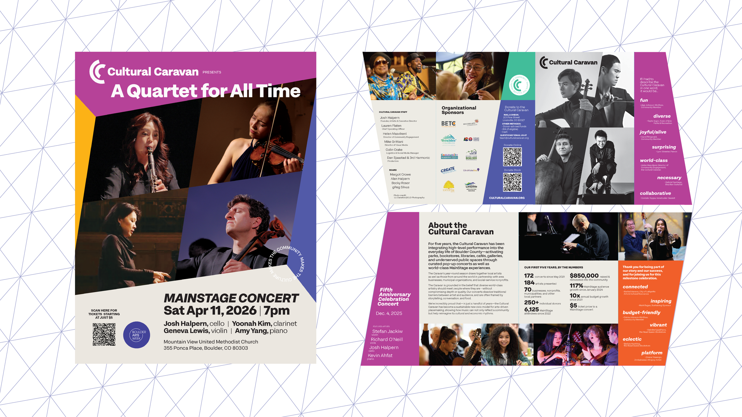
PRINT COLLATERAL
1. immerse
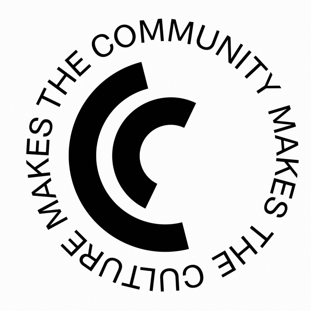
Community Makes the Culture, Culture Makes the Community
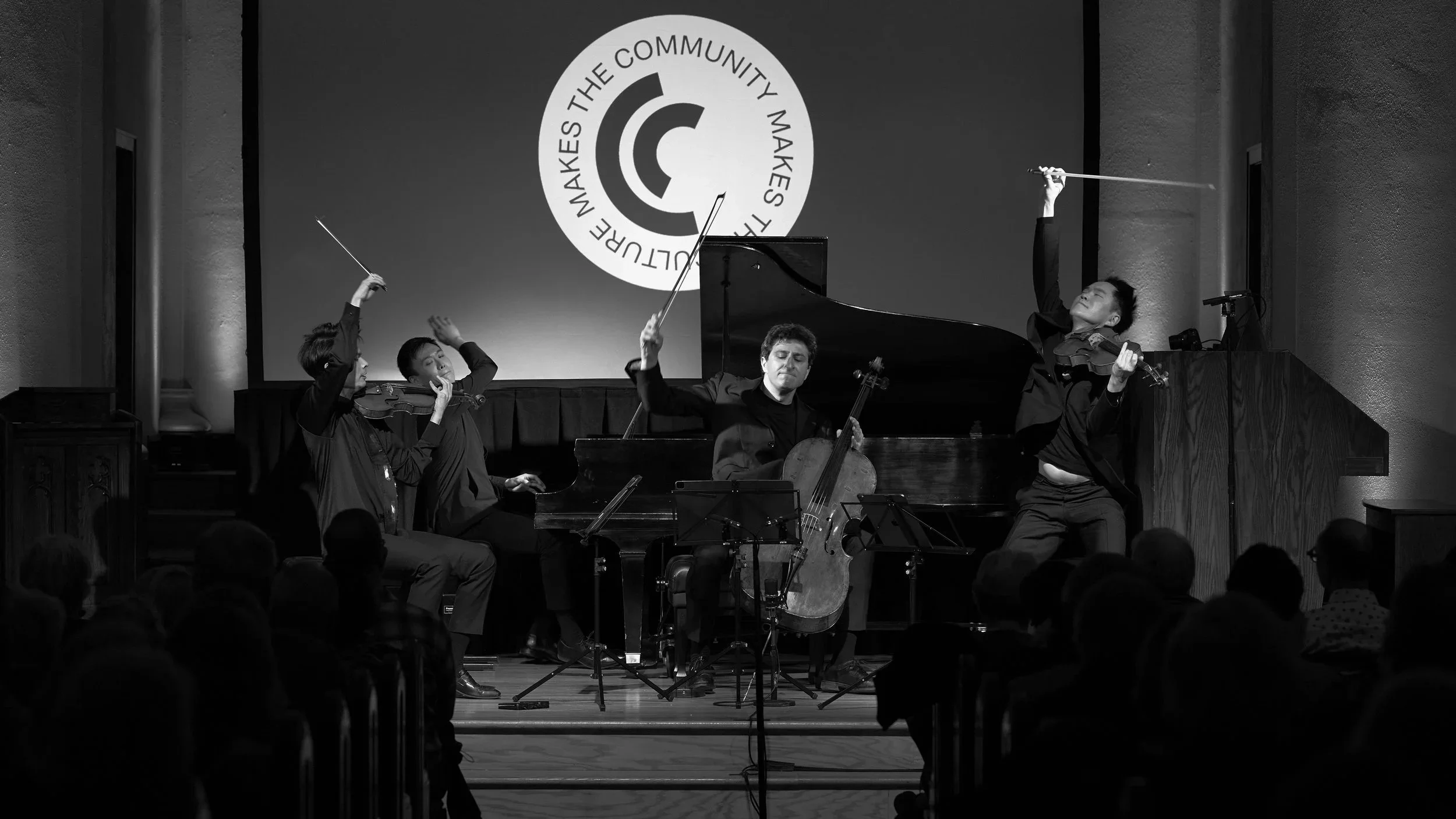
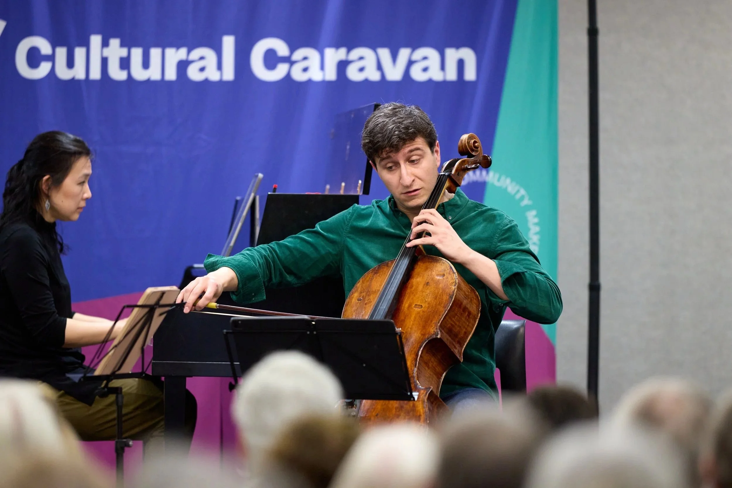
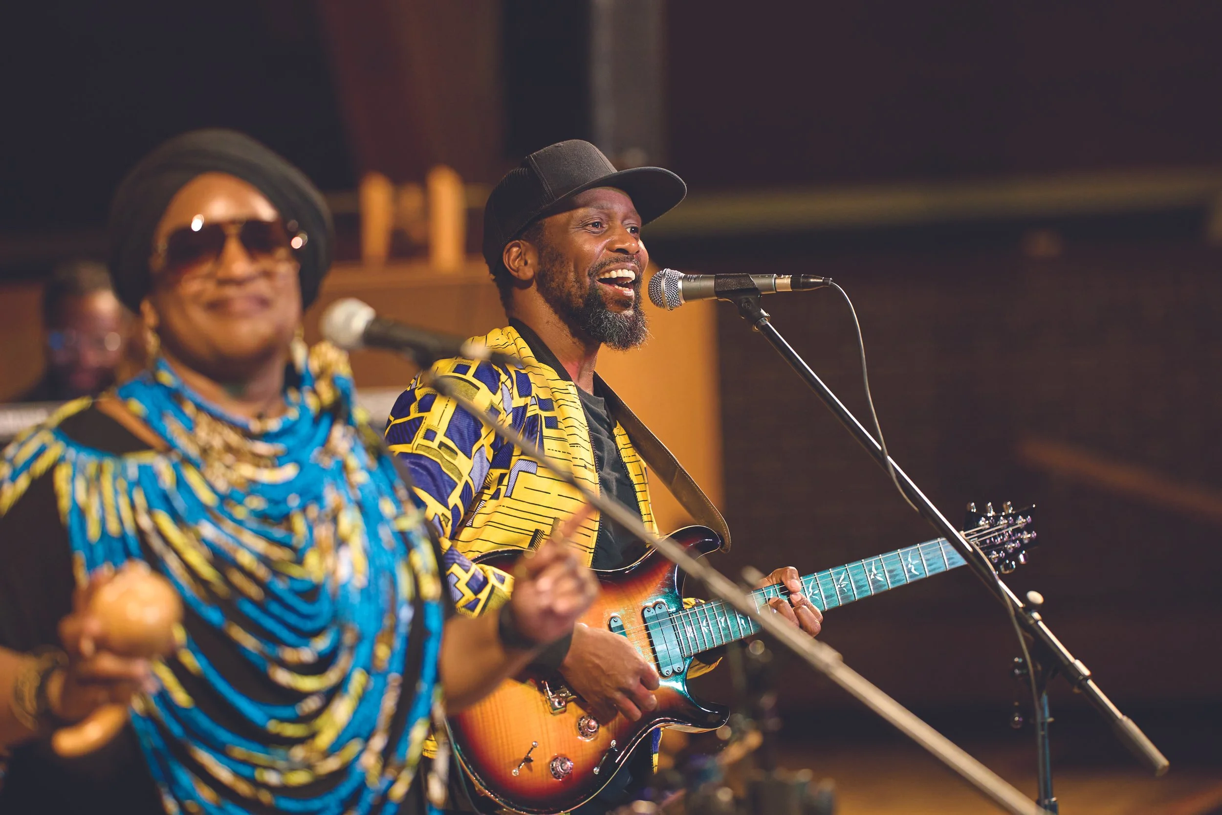
The Cultural Caravan is grounded in the belief that diverse world-class artistry should meet people where they are-without compromising depth or quality. Their concerts dissolve traditional barriers between artist and audience, and are often framed by storytelling, conversation, and food that help tell the story of performers.
The Caravan has been integrating high-level performance into Boulder County—activating parks, bookstores, libraries, cafés, and underserved public spaces through curated pop-up concerts as well as world-class MainStage experiences. The evolved brand needed to stay familiar to supporters, but uplift and clarify their identity across mediums.
2. imagine
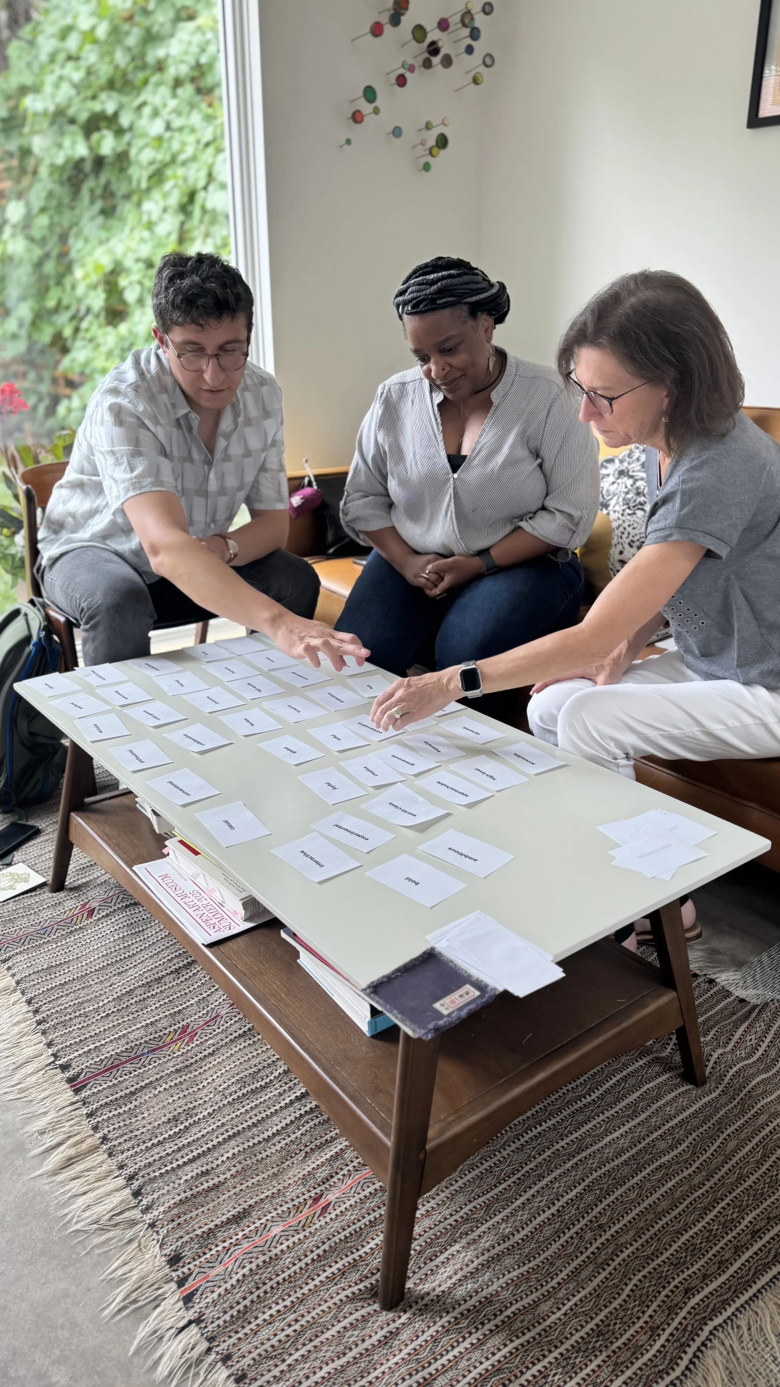
During a collaborative and hands-on Collective Intelligence Workshop, we facilitated a deep dive into understanding their offerings, their audiences, and what’s truly unique about the Cultural Caravan.
Cultural Caravan is the only world-class music organization that unites diverse genres, spaces, and communities—bringing artists, audiences, and partners together in transformative experiences where everyone feels seen, connected, and inspired.
From a strategic foundation, we launched into evolving the design system, so that the logo, type & color palettes, and overall graphic language work together to bring the Cultural Caravan persona to life.

LOGO
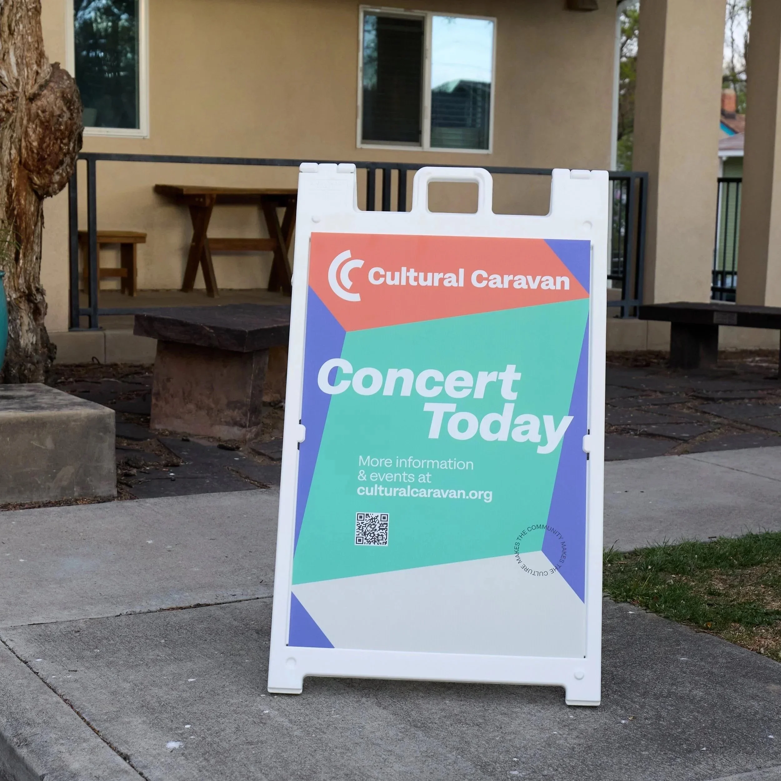
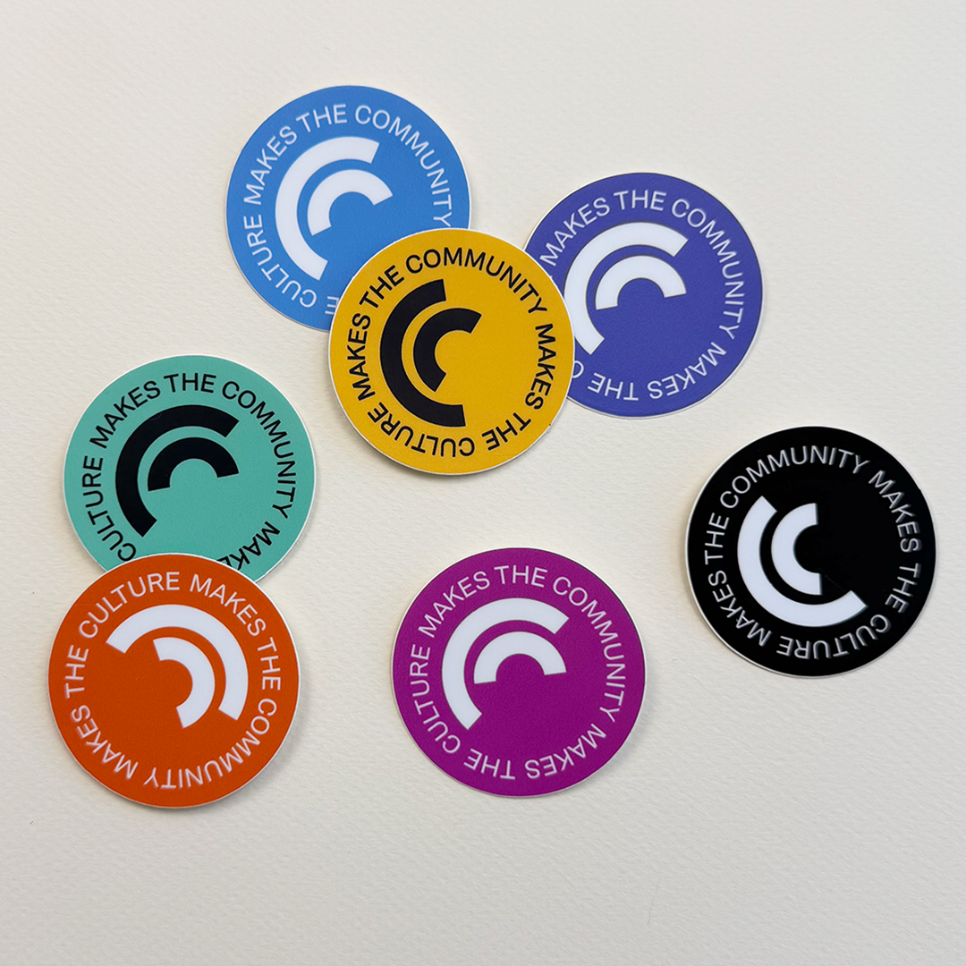
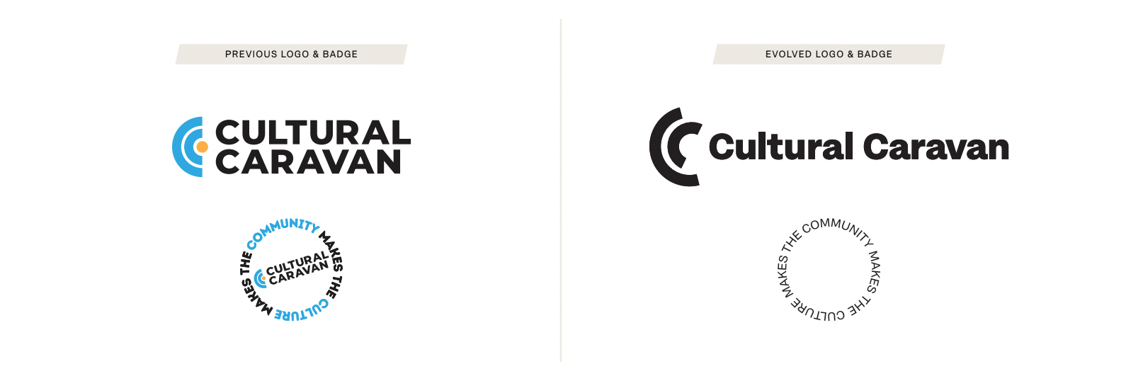
Rather than starting from scratch, the Caravan wanted to maintain some equity from their existing logo. The evolved icon maintains the nested “C” monogram of the original design, removing the central dot for more playful openness. This places more visual emphasis on the curved shapes, which can be read as audience, community, and sound waves. The C’s rotate around a central axis, conveying the dynamism and aliveness of the Cultural Caravan’s programming.
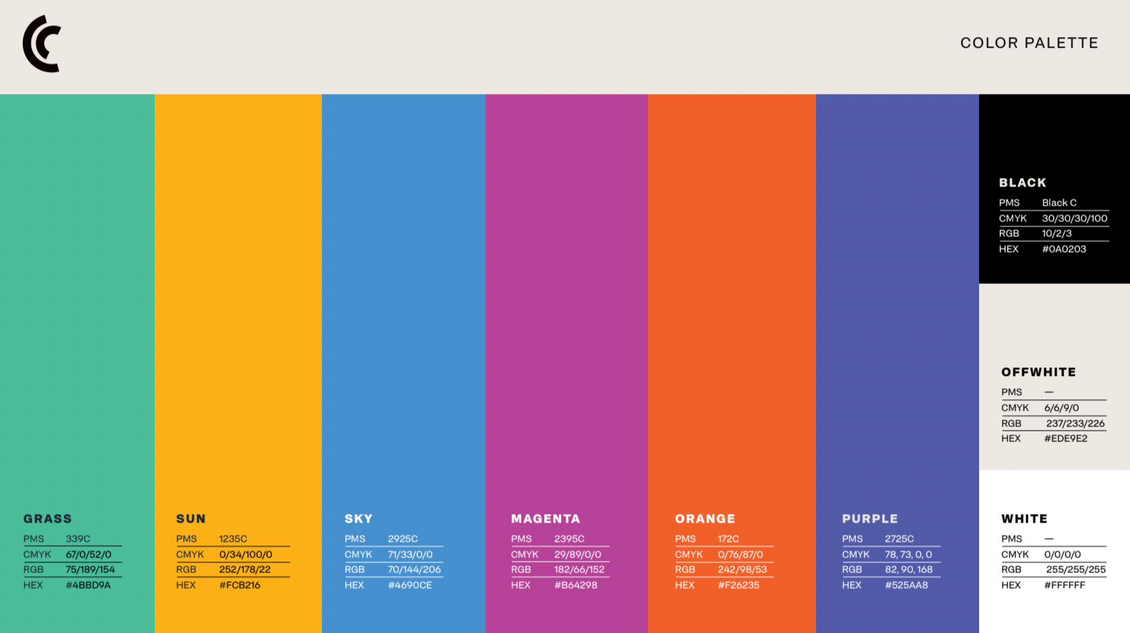
COLOR PALETTE
Vibrancy and diversity are at the core of the Cultural Caravan palette. Six bright colors convey the variety of the musical offerings from around the world, as well as the diversity of the Cultural Caravan’s audiences. Used just three at a time, and paired with the crispness of black or white typography (& black and white photography), the vibe is at once elevated, refined, and unexpected.
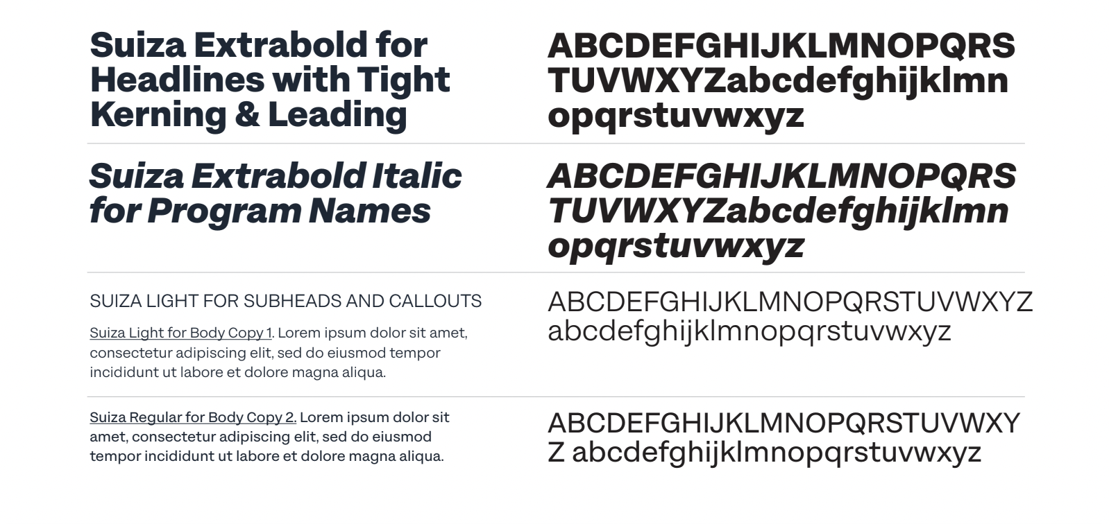
TYPOGRAPHY
A single font family serves as the Cultural Caravan type palette. Suiza is a contemporary sans-serif typeface that combines versatility with a rational, modern character. Rooted in the Swiss typographic tradition of the 1960s, it blends classic precision with a fresh, dynamic sensibility. Suiza harmonizes both geometric clarity and functionality with the warmth and expressiveness of Latin design. Featuring 18 weights and rigorous construction, it functions as both an accessible workhorse, and stylish vehicle.
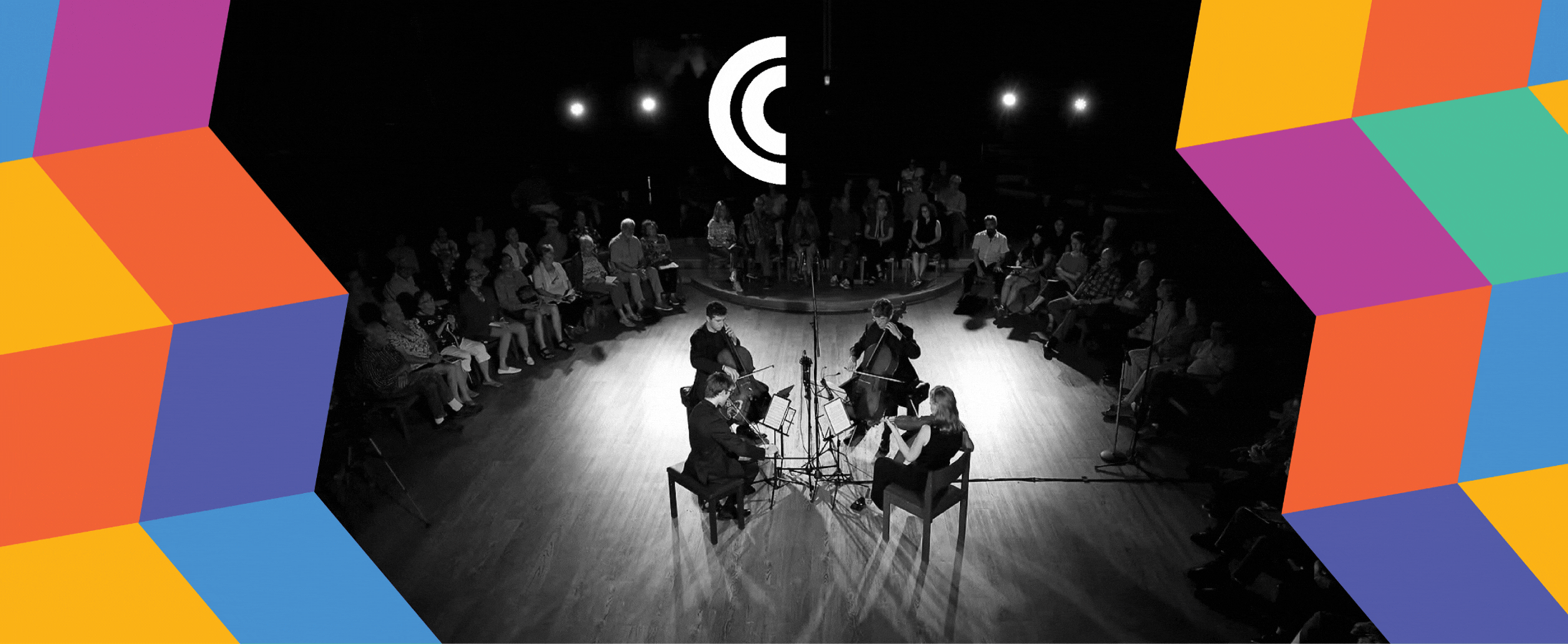
TRAPEZOID GRID SYSTEM
Movement was an important theme that guided our creative process, to reflect the way the Cultural Caravan pops up throughout the community, lighting up venues and connecting audiences with their world-class offerings.
A trapezoid grid system emerged, built at a 10° angle to echo the italics in our typeface, Suiza. The framework holds colored trapezoids and photography to connect and unfold dynamically, in the way that the Cultural Caravan’s events and concerts are woven throughout the Boulder County community.
The grid is a base for a patchwork pattern that expresses the exuberance and diversity of the Cultural Caravan’s artists and audiences.
3. implement
With a clearly defined brand system, implementation across platforms and mediums breathes life into the brand as it moves from posters and programs to social media posts and merch.